

Anyway, I agreed that just spouting some words about how things might be improved wasn't the best way to advance, so I had a look at Diva. I'd not used it in a while (sold it as I was focusing on Zebra/HZ and hardware analogs) I came up with some small changes that I think could go a long way to making Diva easier for a beginner to understand. Let me state a few things before the rocks start coming.
This is just a quick comp to provide proof of concept and spark discussion. (I know things like Pitch wheel wouldn't make sense to rectify, but I wanted a long name for font sizing) I'm aware this creates a big blank space. What could go there? MORE LFOs and an extra envelope please!
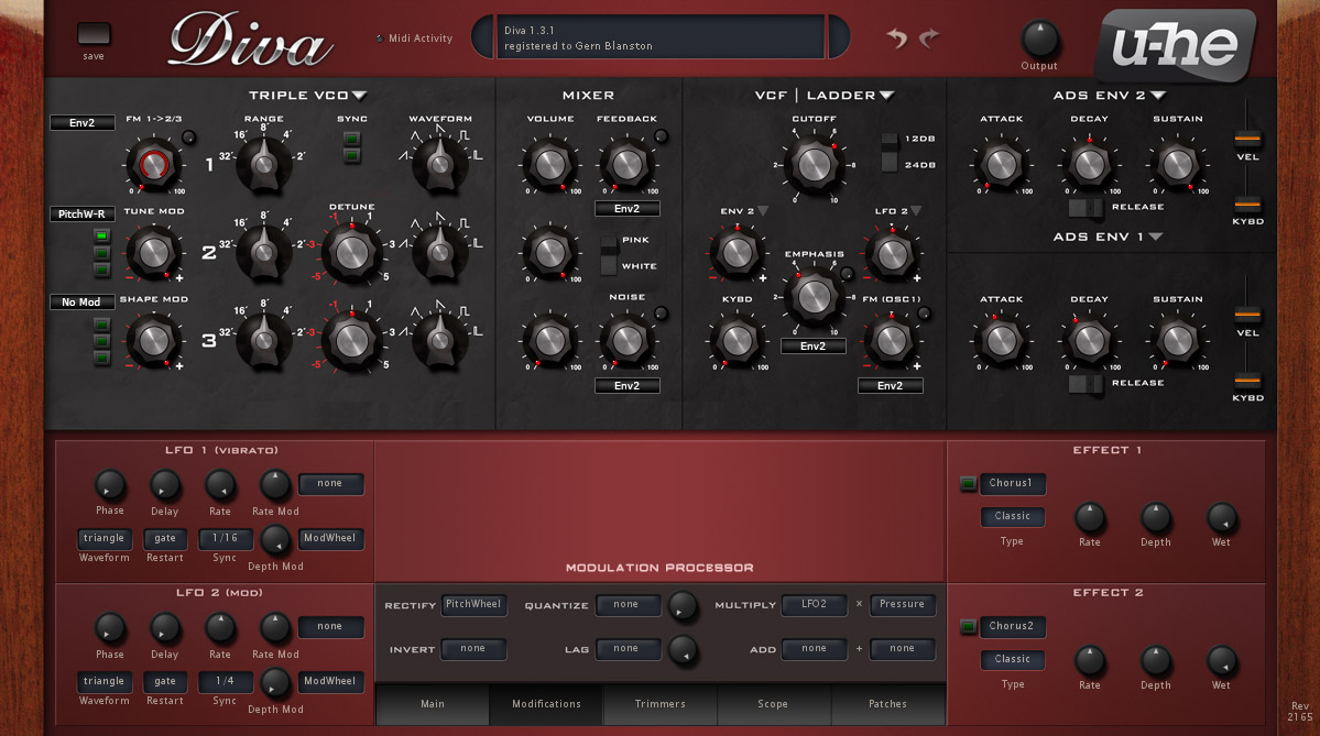
It's unfinished. There are many things I'd move or change in an actual design to give elements more of a chance to breathe. Ditching or truncating the wood side panels for instance would allow elements to be better spaced. I've got work to get back to so I just did this as quickly as I could.
It's purposely inconsistent. I left some elements in their current state to show contrast.
Some notes:
One of the things I've found about the modification section is that it can be confusing at first because controls are there regardless as to their ability to change things in the current configuration. For example, FM/Cross mod controls are there if you've got DCO selected. Initially this leads to a bit more clutter, but I think when real estate is better parsed out, the end result will be more ergonomic and conform to how the main modulations are already being done. I think consistency would be more important than the extra bit of clutter my design creates.
On the Modulation Processor, I realized that what was confusing to me was the naming convention. You'd want a rectified LFO as a modulation source, so you'd set it up and then see "rectfy" as the new name of the mod source. It's fine if you just set it up and it's in your memory, but if you're using a preset or coming back to one of your own presets, you've got to click on the modifications tab to find out what's going on. So, I propose changing the naming convention (not sure if there are tech limitations on this) so that if one chooses "Pitchwheel" as a destination for "Rectify" you'd get a choice of "PitchW-R" in your mod source drop down menu. So now, when you look at any patch and see "[modulator]-[letter]" or in the case of multiply and add, [modulator]-[modulator]-[letter] So something like modwheel multiplied by pressure would read "Mod-Pres-M."
Your questions and comments are always welcome... Unless you're a jerk. [edit] If you don't have something that actually has to do with UX design of Diva to contribute, please move on.


